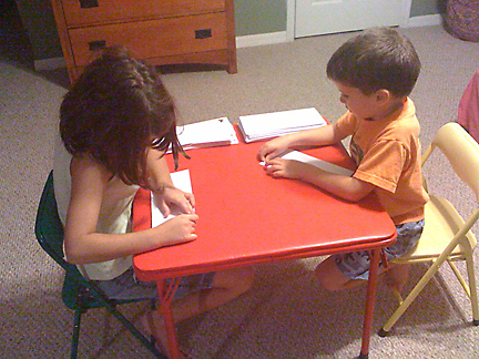
I really appreciate the creativity of our kids. One of the fun things for me this summer was to share with Katy and Ryan the work I was doing with the Summer Project Web site redesign. Several times through the summer, I showed them clips from the main promotional video which served as an inspiration for my Web site design.
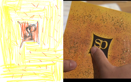
Recently Katy designed her own Summer Project Brochure. Below, you see the cover to her brochure on the left, and the actual cover from the brochure used in the promotional video. You can see how closely Katy matched the details.

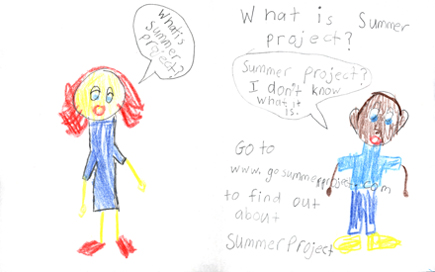
But what I like even more is the inside of the brochure. She has a really simple message that reflects the whole reason my team worked on the Summer Project Promotional Package. It is to answer the question, “What is Summer Project?” I love how her brochure points to the Web site that I spent the summer redesigning.

See bigger version of the inside of Katy’s brochure
